Laika app
Pet Adoption UX/UI Case Study
Helping future owners adopt dogs in an easy, simple and fun way.
15 minutes read
Role
Researcher, Ux &Ui Designer
Team
Alberto Mozo, Patricia Puig, Santi Mirabet and Felipe Cardona
Solution
App design


Overview
This project was created by the UX / UI Bootcamp at Nuclio Digital School. The project tried to find a real problem and solve it through a digital solution. Hence, Laika was born, an app that makes adoption an easy, simple and fun task.
Problem statement
183 thousand dogs arrive in shelters every year. Many of them are healthy dogs that would make excellent pets and need homes. Based on surveys and interviews, most people want to find a dog the ethical way but are hesitant and worry about finding the perfect fit. With these issues in mind, my team and I set out to create a solution.
Our goal was to build an app where people can find a dog that matches their lifestyle, personality and needs.
Methodology
We followed the design thinking methodology, in which the first step was to empathize with the users. Moreover, we defined insights based on their needs and problems. Together with our insights, we created related solutions. With those solutions, we designed and prototyped the different screens of the application and finally, we tested the product with real users to verify our solution.
We also used the SCRUM methodology to organize ourselves: we divided the weeks into sprints, with a backlog full of tasks that we had to do. We assigned the different tasks to each team member and we did retrospectives to see how we could improve the way we worked together.
1. Empathize
After an introductory investigation on different topics that interested us, we came to the conclusion that we wanted to solve a problem around pets.
We wanted to begin by understanding the overall process of pet adoption and what are the pain points associated with it. To gather information about adoption, we conducted some interviews to learn more about the topic and gather more information for my initial thoughts.
I was particularly interested in first-hand experiences and the pain points of the pet adoption process. Along the way, my research helped me uncover additional issues.
-
What is the process of adopting a pet?
-
What kinds of animals do shelters have?
-
Who tends to adopt pets the most?
-
What kind of hesitations do people have?
First, we did open interviews, to not bias users and have complete information about the entire process. We follow by getting more valuable information by asking deeper questions or asking follow-up questions. Finally, the last interviews were carried out to collect the pains and gains of the acquisition process. They were able to explain some of the difficulties they encountered.
In total, we interviewed 33 people interested in pets and obtained more than 200 pieces of information that we divided into pain points (red), gain points (green), relevant facts without value judgment (yellow) and solutions offered by users (blue).
Some of the answers were what I expected, but there were some that changed the way I viewed how people look for pets.
Some insights:
"Shelters did not update when pets were being adopted so some pets were unavailable when visiting the shelter"
"Communication with the shelters and scheduling appointments was the longest part of the process"
"I miss having users filters based on type, gender, age and ratio distance"
"Not very visual and friendly apps"
"I had to check on several different websites before finding the ideal pet for me"
"I have no idea which dog is ideal for me"
1.1 Understanding the problem
To begin, we clustered pain points according to the pet life cycle, which we divided into three parts: acquisition, management and death. With the pain points, we generated the insights (orange) in each phase of the process.
Once we had all the insights, we focused on the adoption of dogs, since we found most paint points in that section.
The Mighty HMW’s
Based on the problem statement that has been made, we will re-frame the problem again so that we can design the right and best solution. We need to write down “how might we” before proceeding to the ideation stage which will bring up ideas as a solution to the problem.
We select the problems that we consider most relevant for users: search, communication, paperwork, and quality & experience.
1.2 Investigation
We carried out in-depth desk research to find out the real problem.
Key Insights
-
Users were currently using social media and websites to search the dogs.
-
They contacted the shelters through the phone or social networks. Shelters could hardly answer due to a large number of calls.
-
Paperwork was tedious and long since many sheets had to be filled out.
-
The user experience was exhaustive since there was no platform that unified everything. Users had to find all the information in different places.
Competitor Analysis
Next, I moved on to Competitor Analysis to identify different solutions that were on the market and understand what elements are prioritized, get information about features, advantages and especially paint points, look for inspiration and ideas. The biggest takeaway from my competitive market analysis was the lack of existing solutions. Many of the apps that exist are poor, have bad UI, and lack information about the pet. There was only one solution properly solving the issue, and its name was Miwuki. After analyzing the application we saw that usability was not its strong point, so we decided to go ahead with an app.
From my research, I have established that the following variables will have a high impact on the end result:
-
location filters and search results based on location
-
responses to inquiries
-
pet history/search history/saved pets
-
connecting to social as an option rather than a requirement
1.2 Problem validation
Once we knew the problems in-depth, we conducted a survey to validate the research hypothesis. A total of 340 people answered which 90 of them were possible users of the app (people who were in the process of adoption or had recently adopted).
One of the aspects that impacted us the most was how people did not perceive the paperwork as a relevant problem. Nevertheless, we concluded that the process of contacting the shelter was a priority.
In addition, we made a couple of dynamic tables to get better results. We crossed the age of users with the question of "Have you ever adopted or are you in the process of adoption?" (So that the number of users was not a bias, we did the calculations applying the percentage of users in each range). The result was that users between the age of 25 and 45 were the most susceptible to adopt, that is why we based our user persona on that average.
2. Define
User persona
We defined a user persona and its current journey map based on all the information we collected.
Different user profiles were established that would use our app. They are people who have in common empathy for animals, the willingness to dedicate time, space and/or money to be with them.
User Journey
With this tool, we can have a vision of what the moods of different users would be like when using our app. Starting from an objective, such as "Can we get Elisa to adopt a dog compatible with her lifestyle?" We exemplify the emotions that she could feel in each interaction, proposing the pains and gains that may arise until the user completes the task successfully.
2.1 Value and functionalities
We performed the value proposition canvas to know what would be the gain creators and pain relievers of our product. The gain creators are gamification in the form of swipes and a compatibility test. The pain relievers are clear and concise dog information and the look & feel of the platform. Furthermore, we executed a business model canvas, even though the end goal of this app was not to make money.
Once we knew what our value proposition was, we built user stories to create the user activities of our app.
Once we had the user activities, we focused on prioritizing them with the MSCW method (which tries to divide functionalities by a degree of importance).
We separated them to be clear about what our MVP (minimum viable product) would be, and we focus on the MUST and SHOULD category functionalities.
When we learned about the MVP's tasks, we prioritized them with the RICE (Reach, Impact, Confidence and Effort) methodology to know what was going to be the order in which we were going to create the functionalities
After evaluating each one of the functionalities, we were able to get a score that we used to prioritize the screens.
The next step we took was to connect business objectives and user needs with the solutions we propose to address them, creating a value proposition. And we structure these objectives in the Scope Canvas to present to the client.
2.2 Structuring the solution
Information architecture (IA)
Knowing the priorities we build the sitemap to see what the structure of the application would be.
We wanted all the most relevant points to be accessible through the navbar.
User Flow Charts
We created several User Flows to show the various scenarios that could come up for a user on the app. It helps to visualize how the information would be organized and displayed in a way that is easily searchable and understood by the pet adopters to help them achieve their goals. The User Flow demonstrates step-by-step actions taken by each user to accomplish their end goal while using the app.
Navigational Map
With all the user flows defined, we build a Navigational Map that combines all the possible paths that a user could take inside our app.
We draw Crazy 8s to capture how we imagined each of these screens.
Low Fidelity Wireframes
We did voting on the elements that we liked the most about each screen and after simplifying and refining, I turned them into low-fidelity wireframes.
3. Design
Once we had all the wireframes for the MVP, we defined the style guide and personality of the app. We chose blue as the main color since it conveyed calm and confidence, and the secondary color light green, for similar reasons. We named our app Laika in honor of the first dog that went to space. Laika was an abandoned dog that was trained to become the first animal in space. She was rescued as they thought a street dog would endure extreme temperatures and hunger. They sent her to space and abandoned her. That's why we chose her name, to remind people that animals should never be abandoned.
With the style guide defined, we began to create the different screens of the application. We selected the iPhone 8 as the device, so we could apply mobile-first to escalate the interface into bigger screens.
3.1 Main screens
Below you can see some of the main screens.
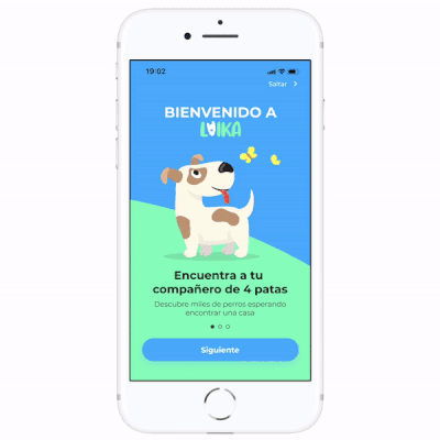
Onboarding
The first thing we find when opening the App for the first time is a simple Onboarding where our value proposition is explained.
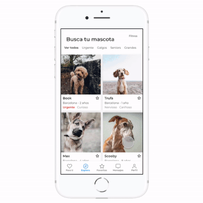
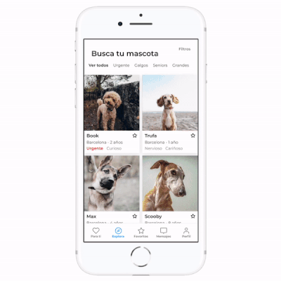
Search dog
Our main purpose was to make dogs the protagonists. Clear screen with information carefully selected.
Filters
The filter icon allows users to adjust filters to control their search results on the Explore page.
Easy to access and adapted to the user´s needs.
Dog profile
On this page, users can see images, pet details and information, a glimpse of their personality and behaviors and contact and request an appointment.
Additionally, it would allow quick access to donate to the dog's shelter.
Furthermore, on this page users, share or save, and inquire if they are interested.
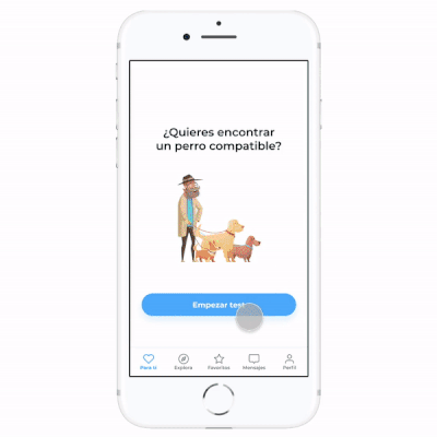
Compatibility test
Once an account is created, users will be given a set of questions in a visual process, playful interface, and clear language, to make their search easier. The questions are designed to provide them with pets that will suit their lifestyle while also allowing shelters to get a sense of the candidate's qualifications.
Users have the option to skip for now and can fill out their profiles later as they use the app. The more questions they answer to complete their profile, the more they increase their chances of being eligible for adoption.
Fast, visual process, playful interface and clear language.
Dog recommender
A personalized experience for every user and gamification (swipes, we inspired on Tinder app).
Book an appointment
Quick and easy process with a clean interface that informs the user at all times.
To schedule an appointment to meet your potential dog
Messages
Easy access from various points, intuitive interface.
4. Test
The user testing was incredibly fascinating, to see how others interact with your design and see it through their eyes. This proved that your design is only a hypothesis until you actually test it.
We built the prototype and prepared the user test. We performed 6 user testings and got a lot of feedback on the project. Furthermore, we made the users test on Miwuki app, our main competitor.
We asked people to perform basic tasks:
-
Signing up
-
Adding a dog to their favorites
-
Donate to a Dog
-
Search for Max dog
-
Make an appointment to the Shelter
These were simple tasks, but they helped me to identify if the flow of the website was intuitive.
4.1 User test feedback
With the user tests, we were able to validate the different hypotheses. First, we confirmed the value proposition of our application. Some of the comments were “I love the idea of the app” and “Super cool as an adoption app”.We also confirmed that the navigation and flows were clear and understandable. Some of the comments were "What I like the most is that it is all concentrated in a single platform and the match system" and *"I find it very practical, especially the fact of being able to message with several shelters".*Another very important point for us was the UI. Some of the comments were "Visually it is very clean", "It is very visual" and "I love the colors!"
But not all were positive comments, we saw that there were certain aspects that we had improved. Next we show you what changes we made.
Outcome and lessons
In this first case study, working through a project end-to-end is truly exciting. I learned a lot about the complete design process starting from the assumption of the problem, validating it with the research process, then designing the solution into an application that is expected to solve the problems felt by users.
I finished the UX / UI Designer Bootcamp wanting to continue learning, working as a Digital Product Designer, in love with this digital discipline closely related to the human experience. I am proud and grateful to my teachers, and all my classmates, especially Patri, Felipe, Santi, and Alberto: I thank you all for helping me to do my best and for encouraging me to explore all the potential I have to develop as a UX/UI designer.


.png)


.png)